Handwriting Styles
The scripts favoured by English scribes evolved and changed over time. At the beginning of the medieval period, scribes used 'set' scripts, which were very formal and tidy. Well-separated letters were their principal characteristic. However, the most significant development in script in the English Middle Ages was the evolution of cursive hands which made the process of writing quicker and more efficient. Cursive scripts contain letter forms made with as few strokes of the pen as possible. They were first developed for the speedy copying of official documents or records, but gradually became used for copying other types of text. Many hands are made up of a mixture of characteristics from different styles.
Textura Script
Sometimes called Gothic Book Hand or Black Letter, this was the most enduring script of the Middle Ages and was in use from the twelfth to the sixteenth century. It is not a cursive hand, and is instead characterised by an upright appearance, and the use of separate strokes to form letters, which required the frequent raising or lifting of the nib from the writing surface. Letter forms are kept separate from one another, and when well spaced give an appearance of formality and neatness. There are various different forms of Textura, usually characterised by the way in which scribes formed the bottom of their letters.
The example below is a Textura Quadrata hand, written c.1250-1300. Quadrata is the 'high-Gothic' variety of Textura, which is characterised by the consistent use of diamond-shaped feet on 'minim' letters made up of vertical strokes (such as i, m, n, u). The script is very regular and used for good quality books. Note the diamond shapes at the end of the lines and, less clearly, at the foot of letters. The top stroke of the letter 'a' is open, which is not a characteristic of true Textura Quatrata.
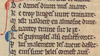
Detail from WLC/LM/4, f. 8v
The 'rotunda' form of Textura has minims with rounded or curved feet formed through the natural upward movement of the pen nib. This was the least formal type of Textura. In the example below, from the mid-thirteenth century, the letter 'g' is formed like the number '8'. This is seen more frequently in 'Anglicana' hands.

Detail from WLC/LM/3, f. 72r
After the thirteenth century Textura was seldom used to copy literary manuscripts containing texts in English. In the fourteenth and fifteenth centuries it became increasingly associated with liturgical or devotional manuscripts, or luxury books of a secular nature, as a display script. An excellent example of the use of Textura as a display script in a high-quality book is provided by the Wollaton Antiphonal, which was probably written in the 1430s.

Detail from the Wollaton Antiphonal, MS 250, f. 207r
Cursive scripts (Cursiva)
Cursive scripts were developed for business use such as the copying of documents and letters. They gradually became used for the speedier and more efficient copying of literary texts too.
The cursive form 'Anglicana' developed in England from Textura to become the most widely-used book hand of the later Middle Ages in Britain and northern France. It first appears in documents in around 1260, and is the script most often used in the fourteenth and fifteenth centuries for the copying of English literary texts (especially the manuscripts of works of Chaucer and Langland). A variety of Anglicana continued to be used as a legal hand as late as the eighteenth century.
This fragment from the South English Legendary, written in the early fourteenth century, is in Anglicana. One of the most striking differences from Textura is how many letters extend above or below the writing line. For instance, a long-tailed 'r' with the descender reaching below the line of writing (as seen in the second word, 'seruant'), and a long 's' which also extends below the writing line (as seen in the word 'ssame' at the end of the second line. At this date, this script is also characterised by hooks and flourishes.
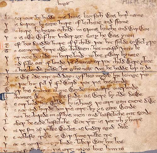
Detail from WLC/LM/38
Like Textura, Anglicana also developed different varieties. 'Anglicana Formata' is the most formal of these. It was used for copying books and shows letter forms which are uniform and separate. Cursive forms are kept to a minimum. In particular, ascenders and descenders are shorter and less exaggerated and the script looks solid and square.
Here are two examples from fifteenth-century manuscripts in the Wollaton Library Collection. The second example shown here is an Anglicana Formata with some traits from Textura, especially in the letter 'd', and in the way the minims have been carefully finished.

Detail from Speculum Vitae, WLC/LM/9, f. 199r

Detail from John Gower, Confessio Amantis, WLC/LM/8, f. 67r
Court hands
The scripts used for writing legal and administrative documents were slightly different from formal book hands used for literary works, but shared many characteristics. These are the hands that local historians will most often encounter. Overall they are called 'court hands', but certain government departments developed their own particular styles of handwriting, such as 'Exchequer hand' and 'Chancery hand', which get harder to read as they fossilize into very stylized forms after the fifteenth century.
The example below is a typically spiky, precise hand used for writing charters in the twelfth century.
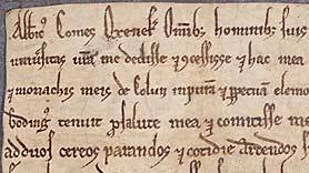
Detail from Me 3 D 2, c.1175
In the thirteenth century scribes began to use a form of Cursiva Anglicana. The hand is rounder and more fluid, but still employs tall ascenders, some of which ('H' and 'L') have hooks at the top. The capital letters are embellished with double lines.

Detail from Ne D 2172, c.1230-1250
Below is an early fourteenth-century example of an administrative record. The cursive style of writing, and the very extensive use of abbreviations, allowed the scribe to write fast.

Detail from manorial court record, MS 66/1, c.1430
In the later Middle Ages there is a lot more variety in types of hand, and many overlaps between particular styles. Here is an example of a cursive script from the late fourteenth century. Ascenders and abbreviations are still quite looped but not as tall and extended as in the previous example.
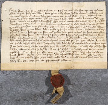
Detail from Ne D 4716, 1388
The next example is a very clear script from the mid-fifteenth century, by the professional scribe 'Froddesham'. In comparison with the previous example, the letters are very tightly formed. This hand owes something to Textura scripts, especially in the way some of the letters such as 'd', 'o' and 's' are written using a diamond, rather than a round, shape.

Detail from Ne D 4662, 1452
Towards the end of the fifteenth century 'Secretary' script, imported to England from France and Italy a century before, came to have substantial influence on the way in which scribes wrote. It is characterised by a slanting or angular appearance and the use of broken strokes where one would expect to find curved strokes used to form the lobes or bows of letters such as a 'a', 'd' and 'g'. Descenders slope and taper.
This marriage agreement includes some elements which would be seen in later Secretary hands, but the writing seems to be a personal, rather hybrid style. For instance, the scribe sometimes writes 'the', but sometimes uses the old Anglo-Saxon letter thorn, 'þe'.
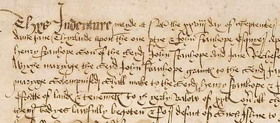
Detail from Ne D 1903, 1476
Next page: Letter forms and abbreviations