Here's a selection of images, each stating their widths. Please use this as a guide to the minimum width images need to be to comfortably fit the range of column widths available to you, for standard pages with a left side menu.
Numbers shown in brackets show the width images need to be on older style pages with no left menu.
Keep in mind
Image height can be tailored to best fit your content and layout.
If your image doesn't quite fit or is wider than your column, apply the class "img-responsive" to the image:
- Right click on the image
- Select Image Properties
- Search for the class img-responsive in CSS Classes
- Save - it'll snap your image to the width of your column
Using img-responsive ensures images fill the width of the screen on mobile devices, however, the deeper your image, the more scrolling for your end users.
You should make sure your image works on every screen size when using img-responsive - if the image is too small then it will look pixelated on some screen sizes as it gets stretched to wider than its actual width.
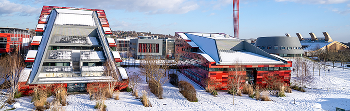
Full width of page - 720px (920)
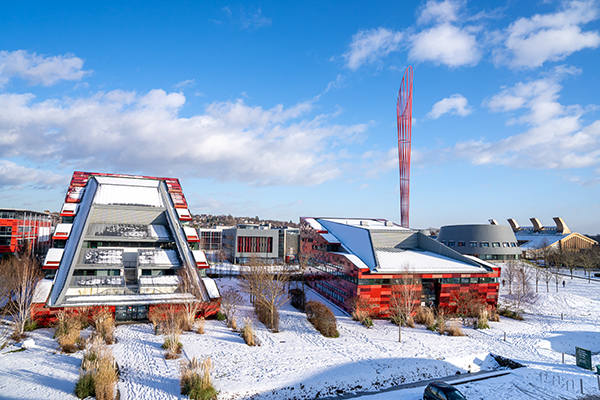
70/30 column
70% column -
465px (602)
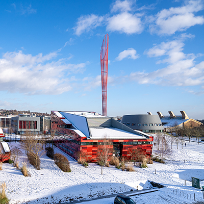
30% column -
220px (285)
50/50 column
50% column - 345px (440)
50% column - 345px (440)
3 columns
30% column - 220px (285)
30% column - 220px (285)
30% column - 220px (285)
4 columns
25% - 165px (220)
25% - 165px (220)
25% - 165px (220)
25% - 165px (220)
5 columns
20% - 130px (172)
20% - 130px (172)
20% - 130px (172)
20% - 130px (172)
20% - 130px (172)